In the past, we've highlighted some of our favorite themes for longform enthusiasts and bloggers who just want to write. Today, let's take a look at five free themes, launched in the past several months, that offer a distraction-free writing and reading experience.
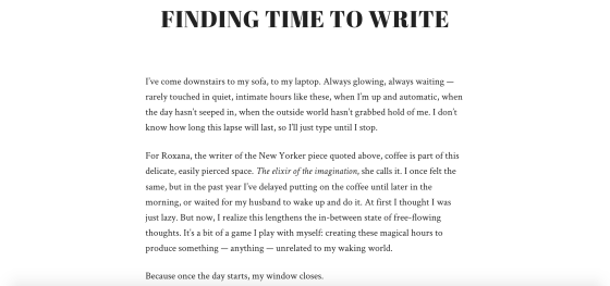
Radcliffe combines bold typography with a clutter-free post layout, as shown above. Ideal for longform writing, the theme works blissfully out of the box for those focused on lots of text. The default headline font Abril Fatface is strong but not overbearing, while the Crimson font for your body text completes this pleasurable reading experience.
Calling out text in various ways also looks fantastic -- for example, the blockquote styling is simple but sophisticated:

But don't be fooled by Radcliffe's simple design. Your photography has a place here, too: full-width featured images give your posts visual flair, while galleries also look lovely, as seen on Sage and Clare.
Go on, give Radcliffe a spin.
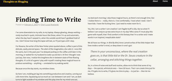
Standard posts on the Cols theme are laid out in newspaper-style format, which is great for essays, articles, and book excerpts. The number of columns changes depending on your device: three columns on large monitors, two columns on medium-sized screens (as shown above), and a one-column layout on small screens like phones.
Whether you add headings, blockquotes, or preformatted text, Cols displays your writing beautifully, providing your readers with an uninterrupted experience. See it in action at Cancer Made Me Do It, or explore more features on its demo site.
Fresh and clean, Penscratch truly gets out of the way and lets your words speak for themselves. It's a solid choice if you want a no-fuss design, but there are options to personalize and brand your site easily, like uploading your site logo at the top.
We also love the treatment of left and right pullquotes, which adds visual variety and is a nice touch for longer pieces of journalism and narrative nonfiction.
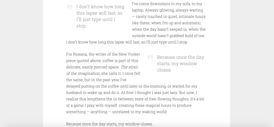
Penscratch works especially well for an intimate blogging space, from experimental writing to thinkpieces to personal essays. But it's versatile enough for anyone! If you're curious how Penscratch looks with images, see how Felicia Sullivan uses it on her blog, which is a tasteful mix of words and images.
Like the themes above, Capoverso is minimal, and its post layout allows your writing to shine. The default background -- a faint grey with diagonal lines -- adds a subtle visual layer to your blog, though you can change the background by using the Customizer.

A notable feature of Capoverso is the Front Page Template, which is handy for writers and authors who want more than just a space for blogging, but a landing page with essential links. You just need to create a static front page (and assign the Front Page Template to it). Voilà:
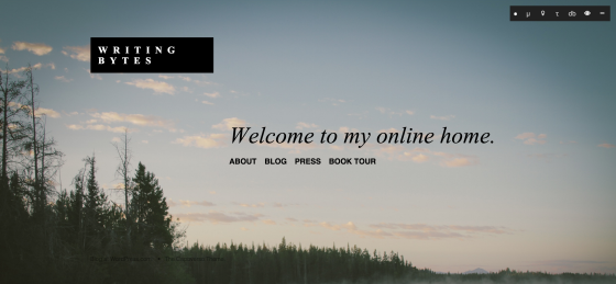
Interested in Capoverso? See how it looks on its demo site.
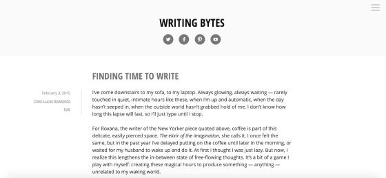
Clean and straightforward, Minnow is a one-column theme that puts your writing front and center -- even your widgets and custom menu are hidden, in a slide-out bar on the right. Despite its pared-down look, Minnow allows writers to promote themselves across all their networks -- it prominently displays your social links at the top, just under your site title.
For bloggers who just want to write, Minnow does the job. Take a closer look on its demo site.


Tidak ada komentar:
Posting Komentar